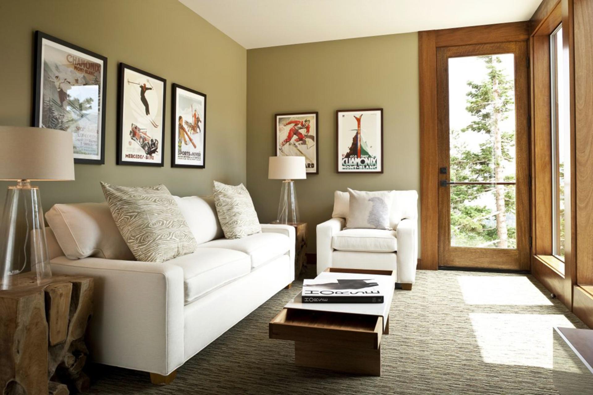
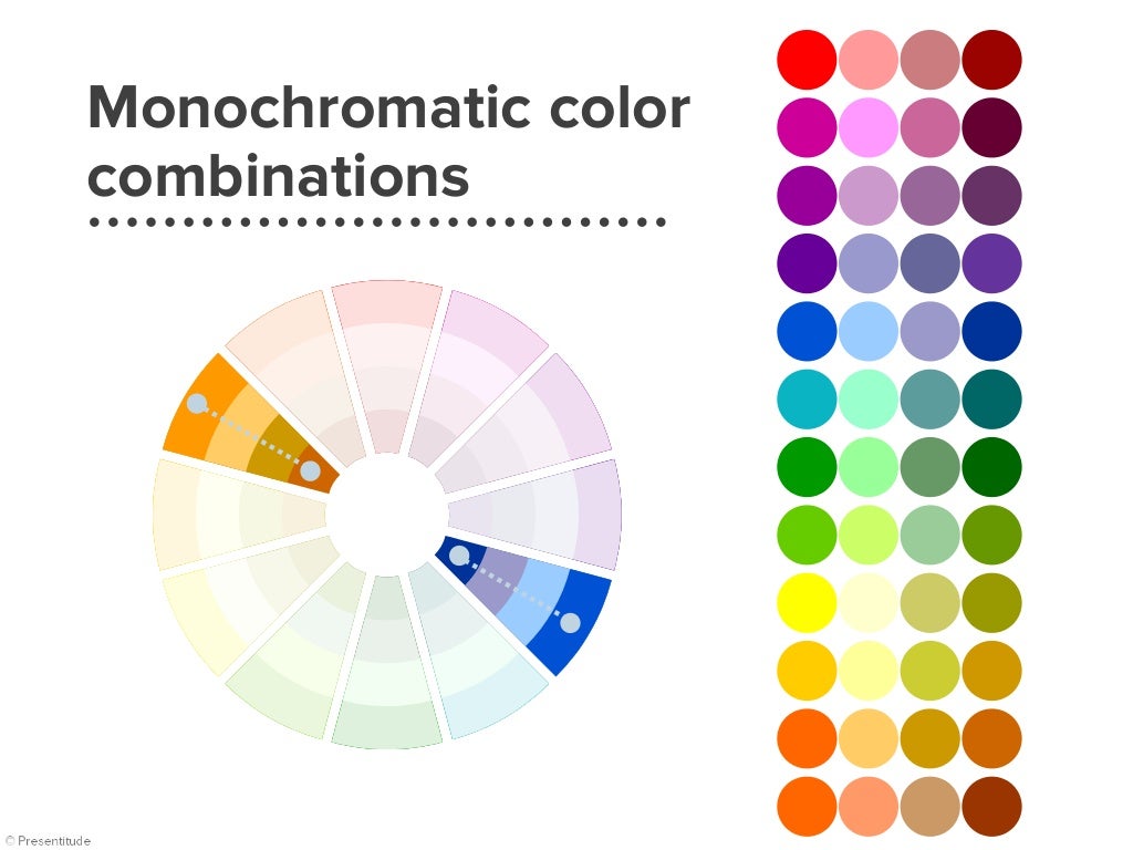
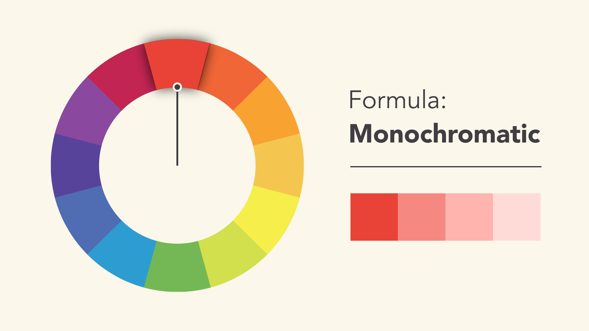
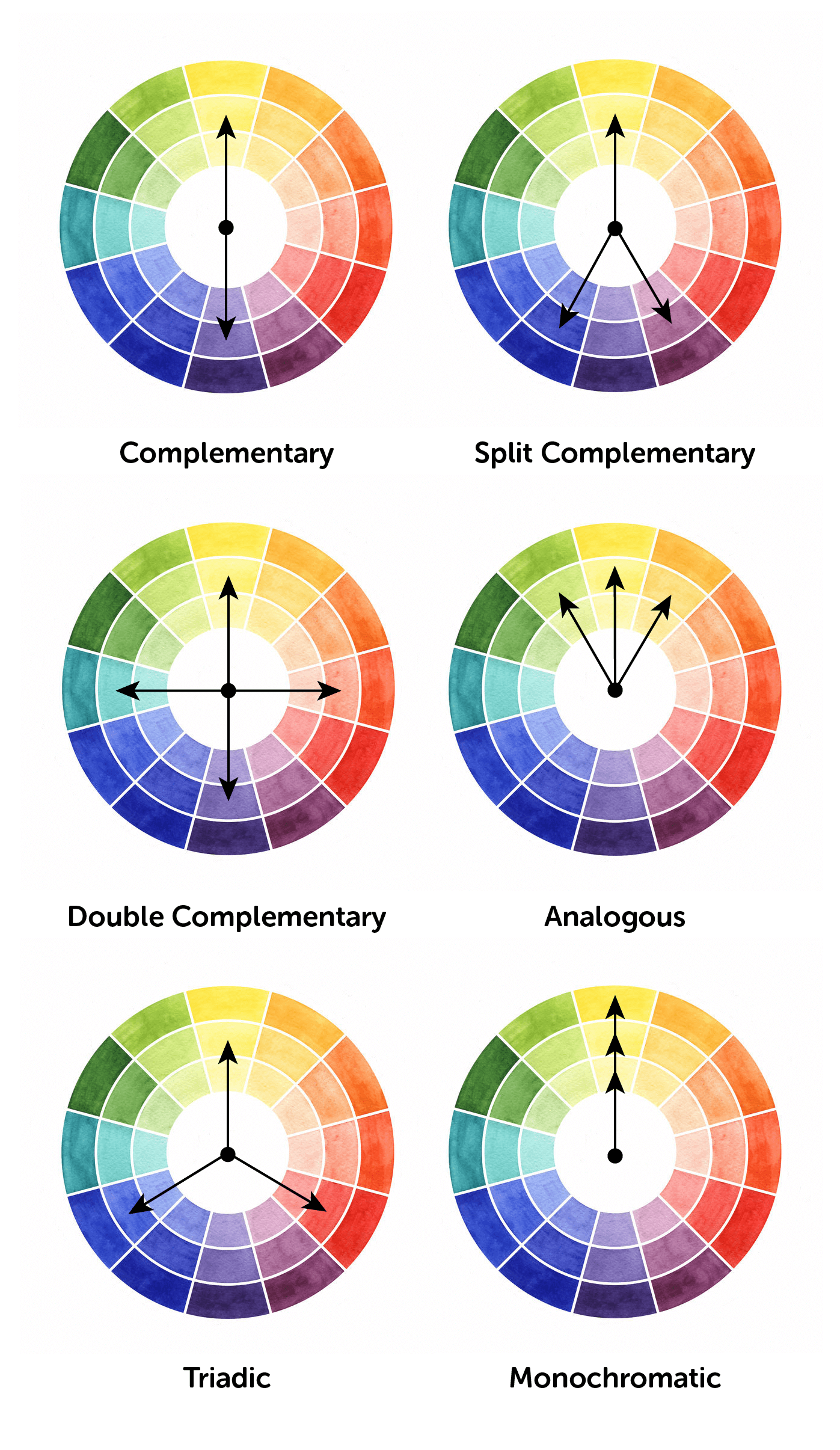
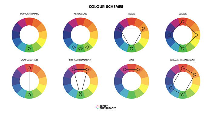
A monochromatic color scheme is one of the most popular and versatile options for a living room. This type of color scheme uses varying shades and tones of a single color to create a cohesive and harmonious look. For example, you could use different shades of blue, from light sky blue to deep navy, to create a serene and calming atmosphere in your living room. This type of color scheme is easy to work with and can be tailored to suit any design style.Monochromatic Color Scheme
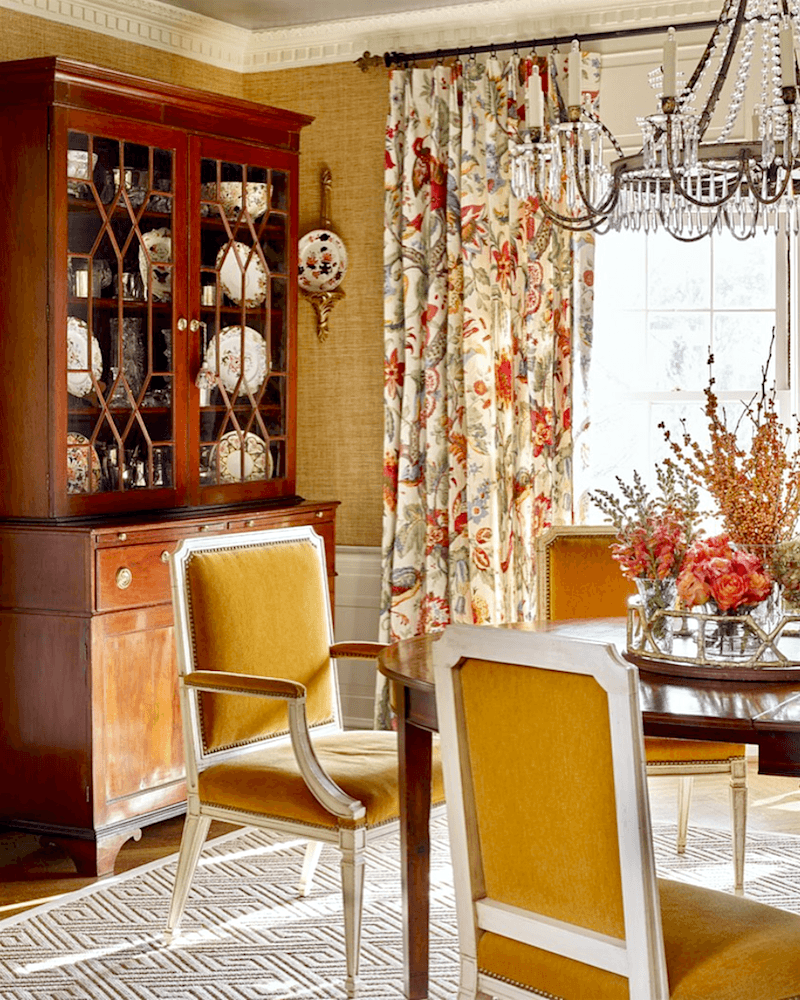
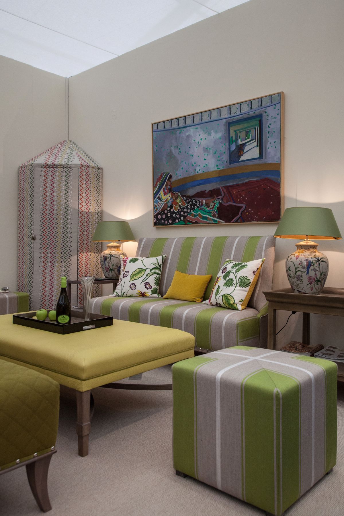
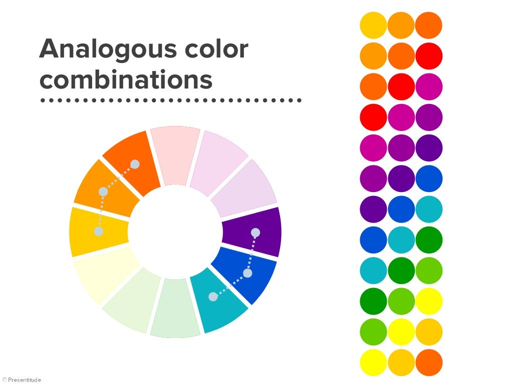
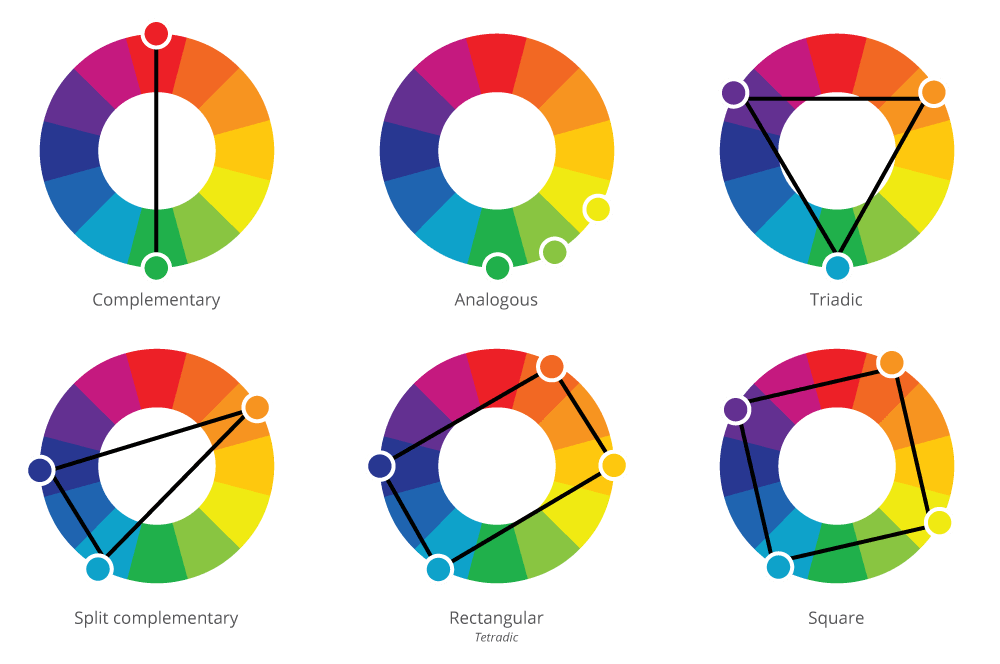
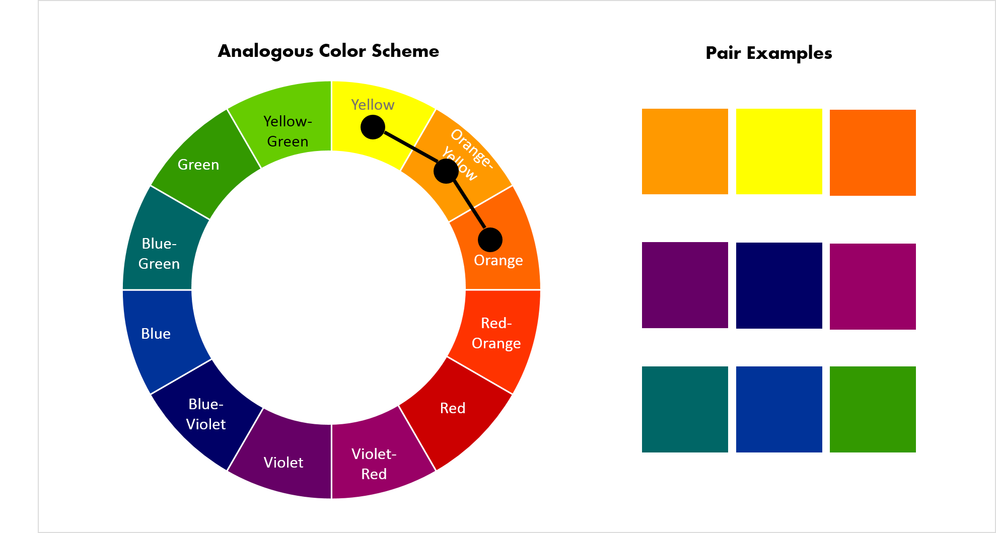
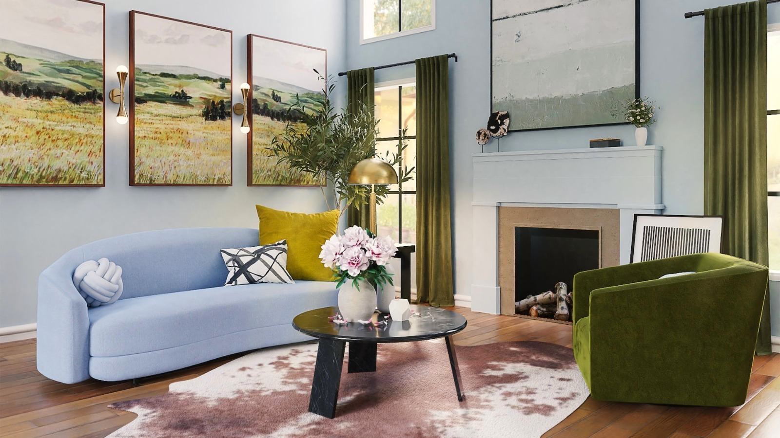
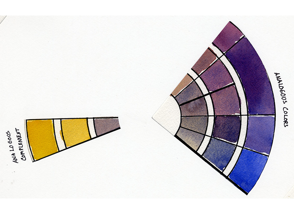
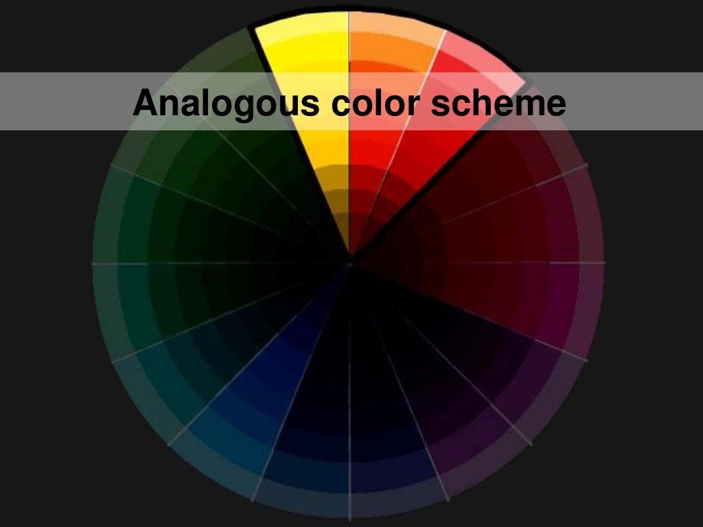
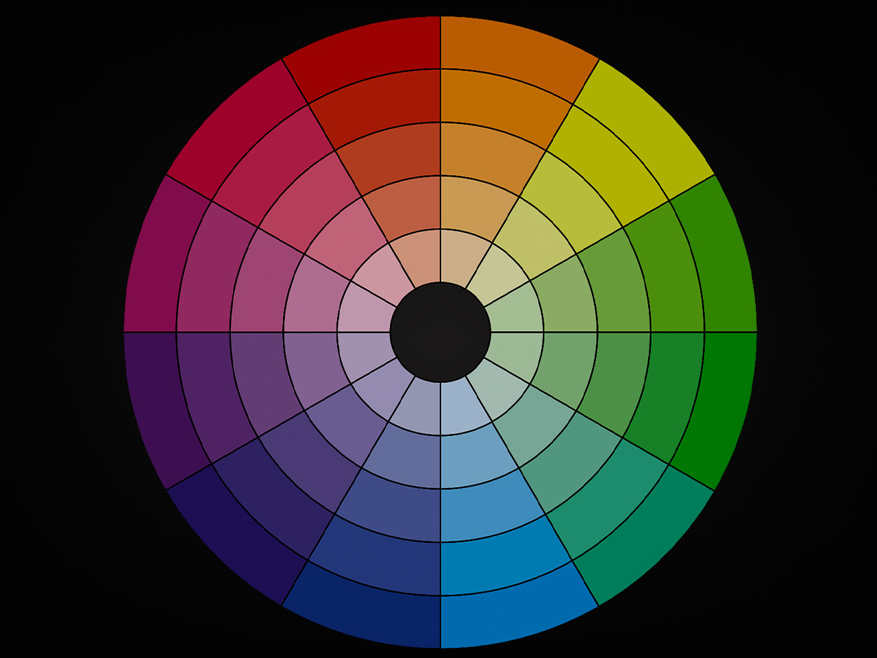
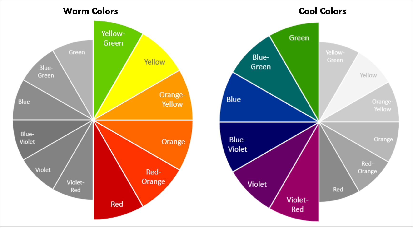
An analogous color scheme involves using colors that are next to each other on the color wheel. This creates a sense of harmony and cohesion, as the colors are closely related. For a living room, you could choose colors like yellow, orange, and red for a warm and inviting feel, or blue, green, and purple for a cool and calming atmosphere. Using analogous colors can add depth and interest to your living room design.Analogous Color Scheme
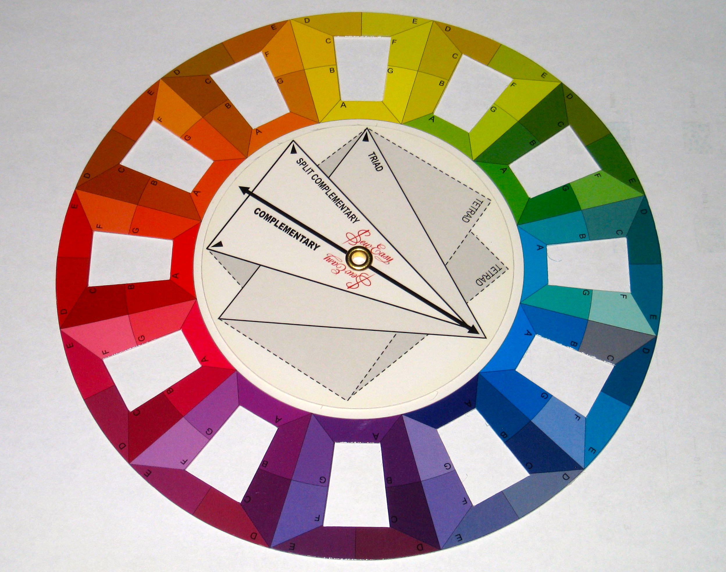
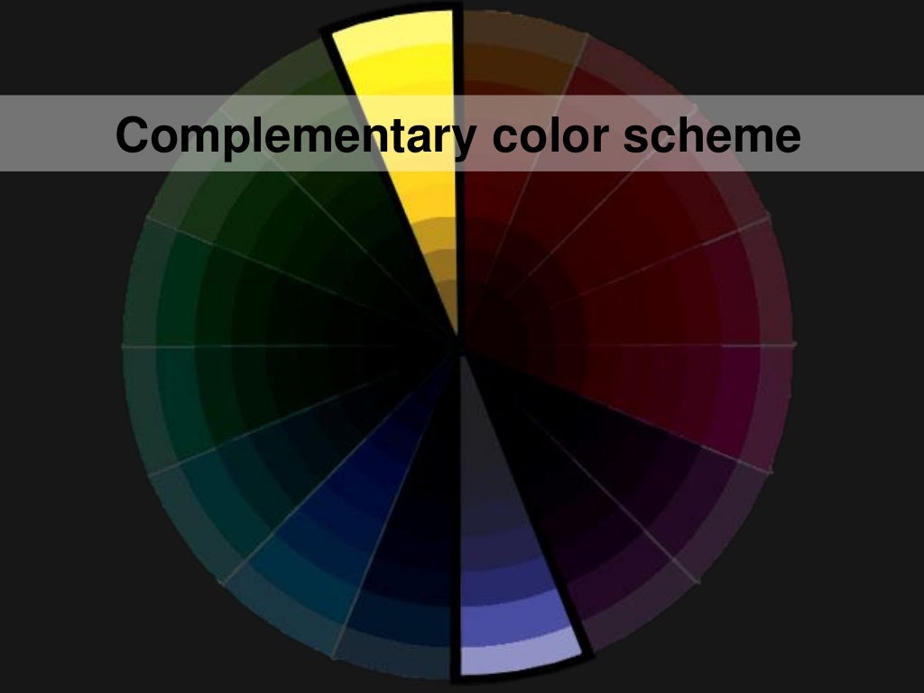
A complementary color scheme is created by using colors that are opposite each other on the color wheel. This creates a high contrast and vibrant look that can be eye-catching in a living room. For example, you could pair shades of purple with shades of yellow for a bold and dramatic look. When using a complementary color scheme, it's important to balance the colors so that one does not overpower the other.Complementary Color Scheme
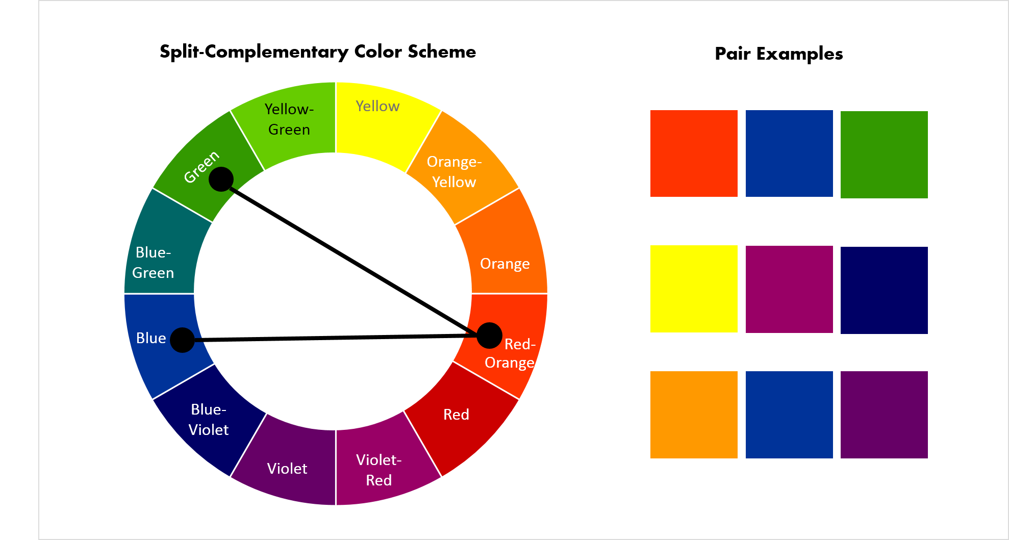
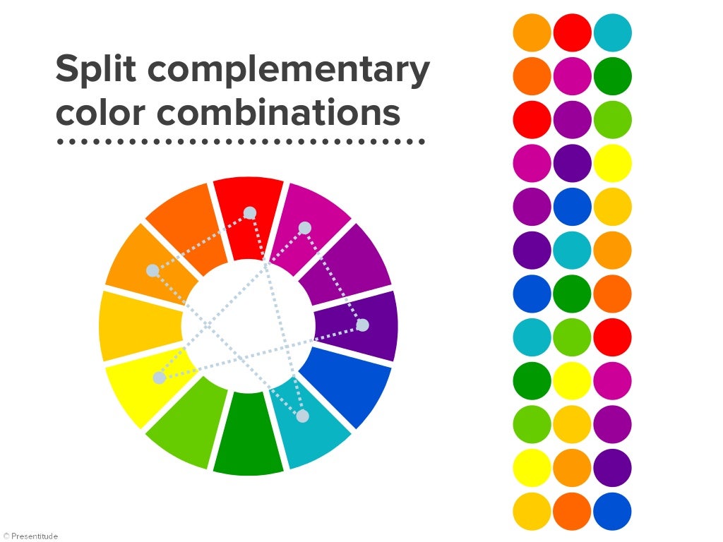
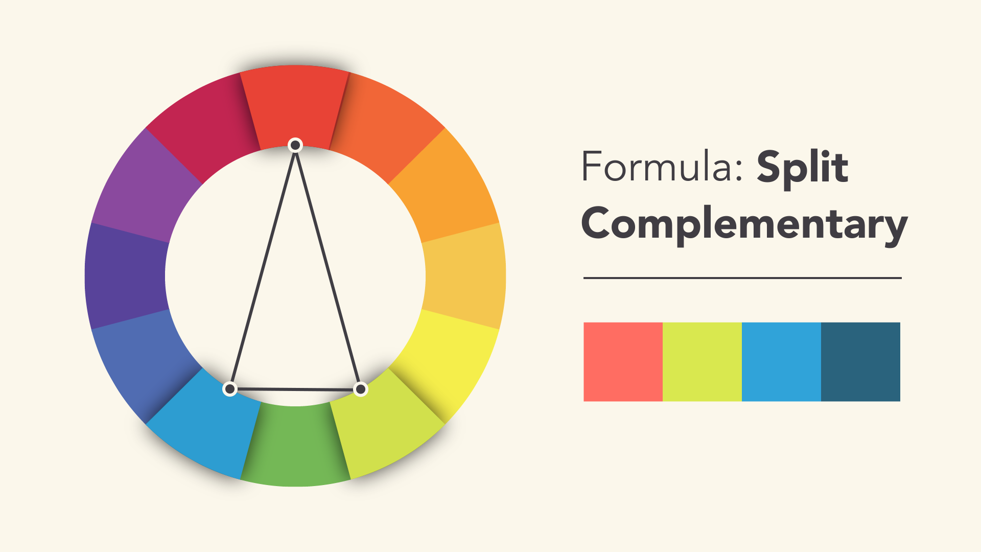
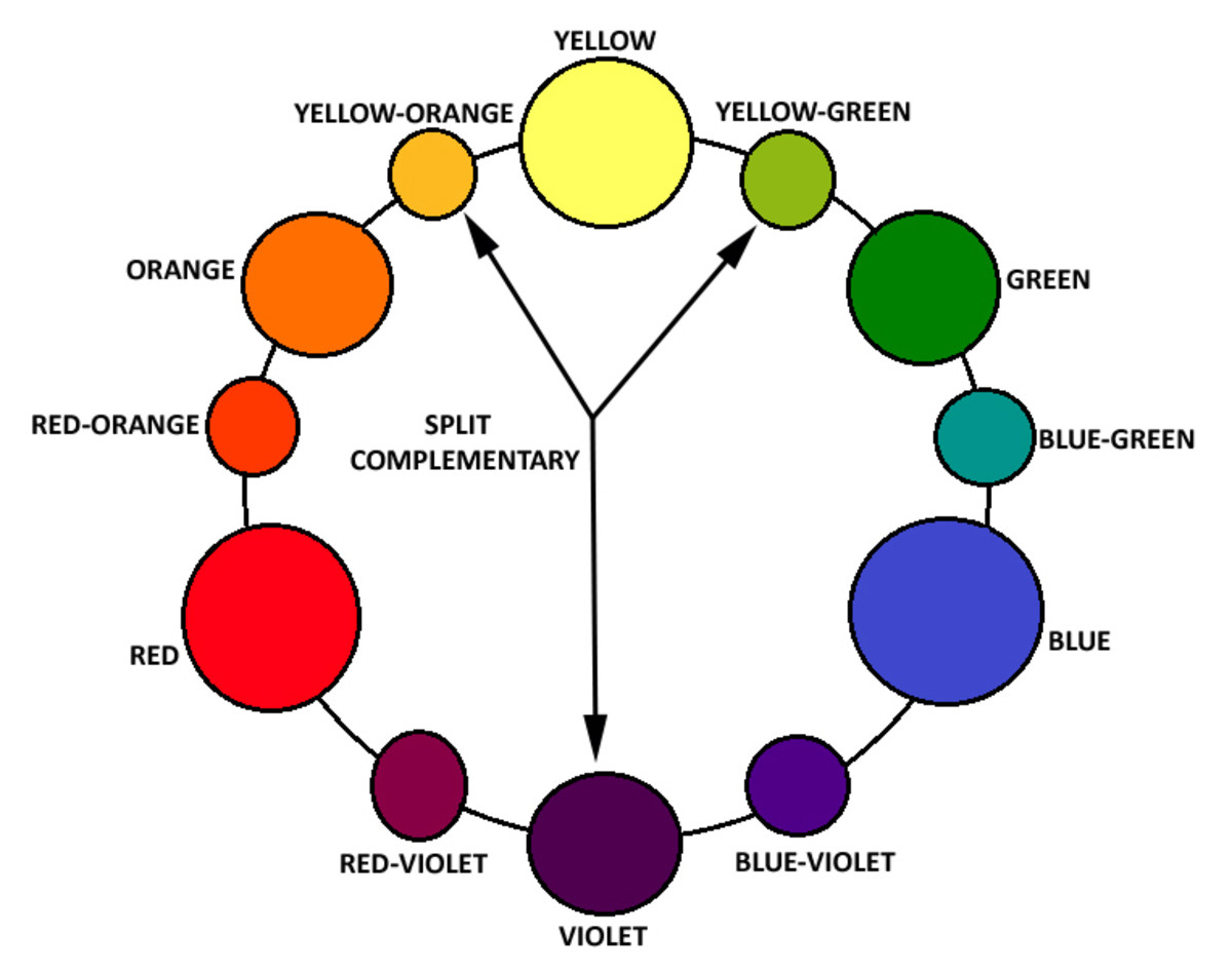
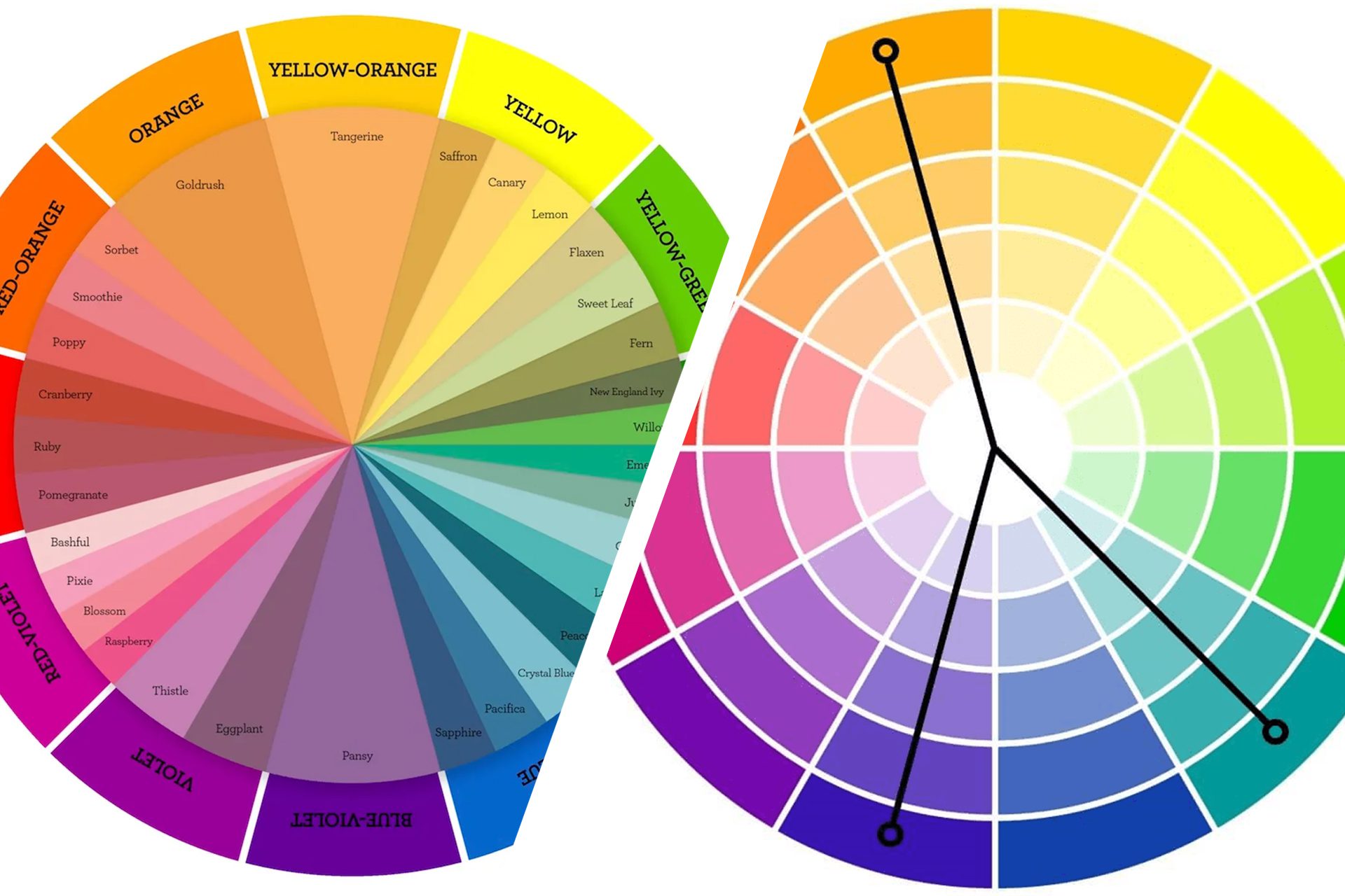
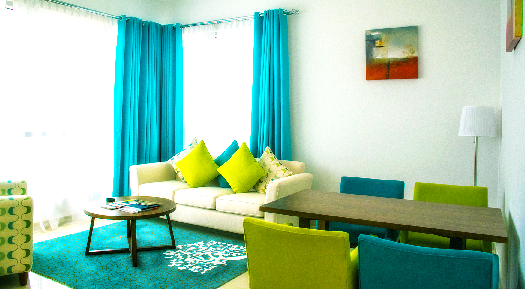
A split complementary color scheme is similar to a complementary color scheme, but it involves using one color and the two colors next to its complementary color. This creates a slightly less intense contrast, making it a good option for those who want a more subtle look. For instance, you could pair a bright orange with shades of green and blue-green for a lively and energetic living room.Split Complementary Color Scheme
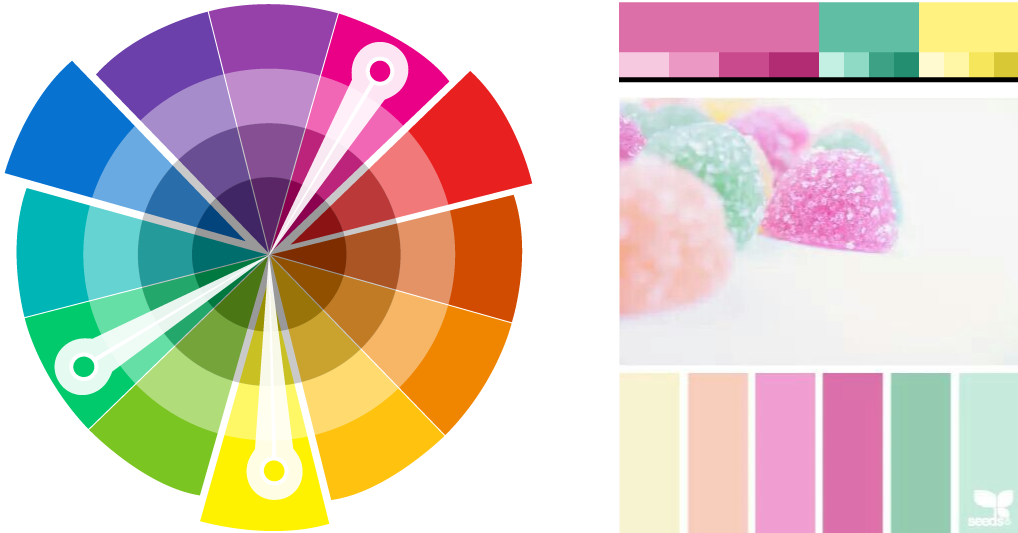
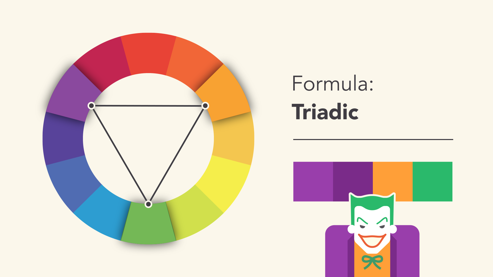
A triadic color scheme involves using three colors that are equally spaced on the color wheel. This creates a well-balanced and harmonious look, as all three colors have an equal presence in the room. For a living room, you could use the primary colors, red, yellow, and blue, for a fun and playful vibe, or opt for more muted shades like pastel pink, light blue, and lavender for a softer and more calming feel.Triadic Color Scheme
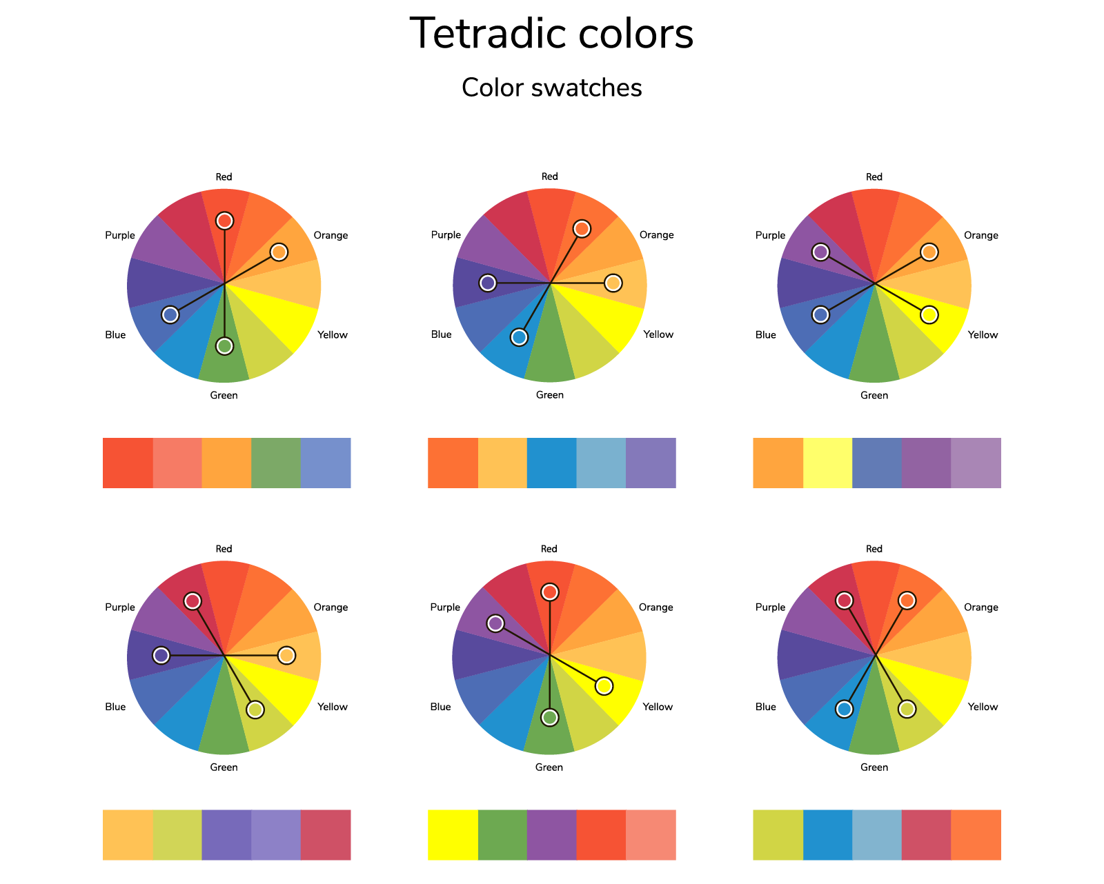
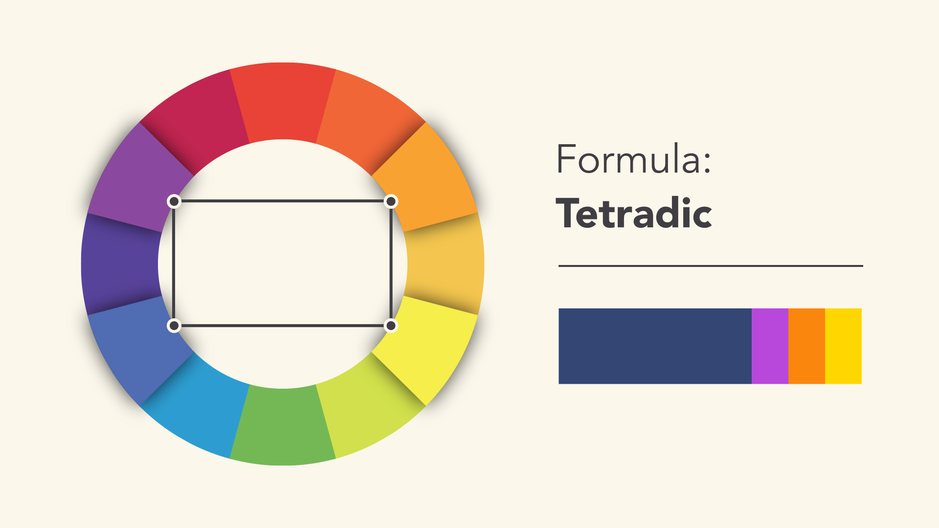
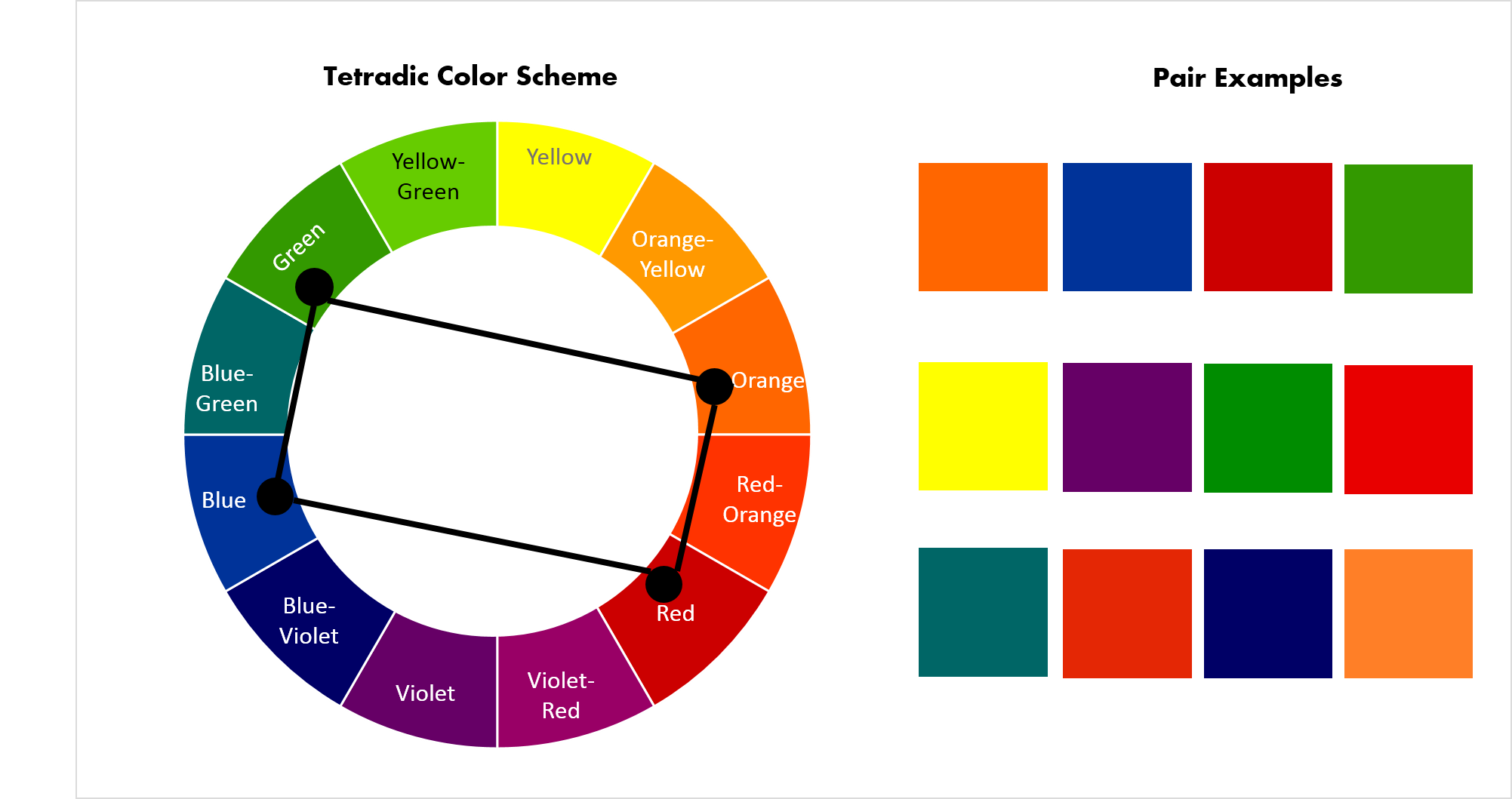
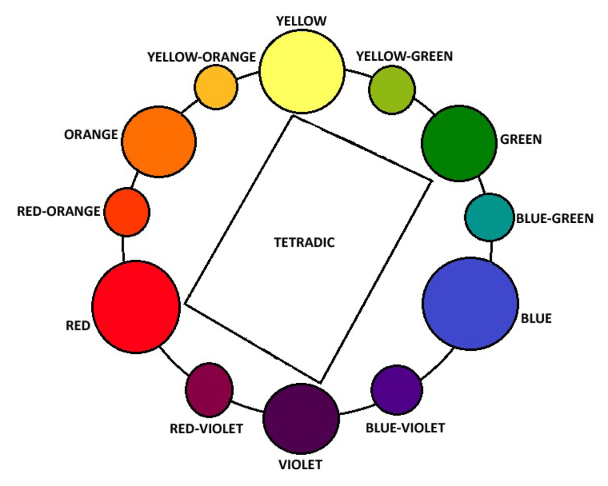
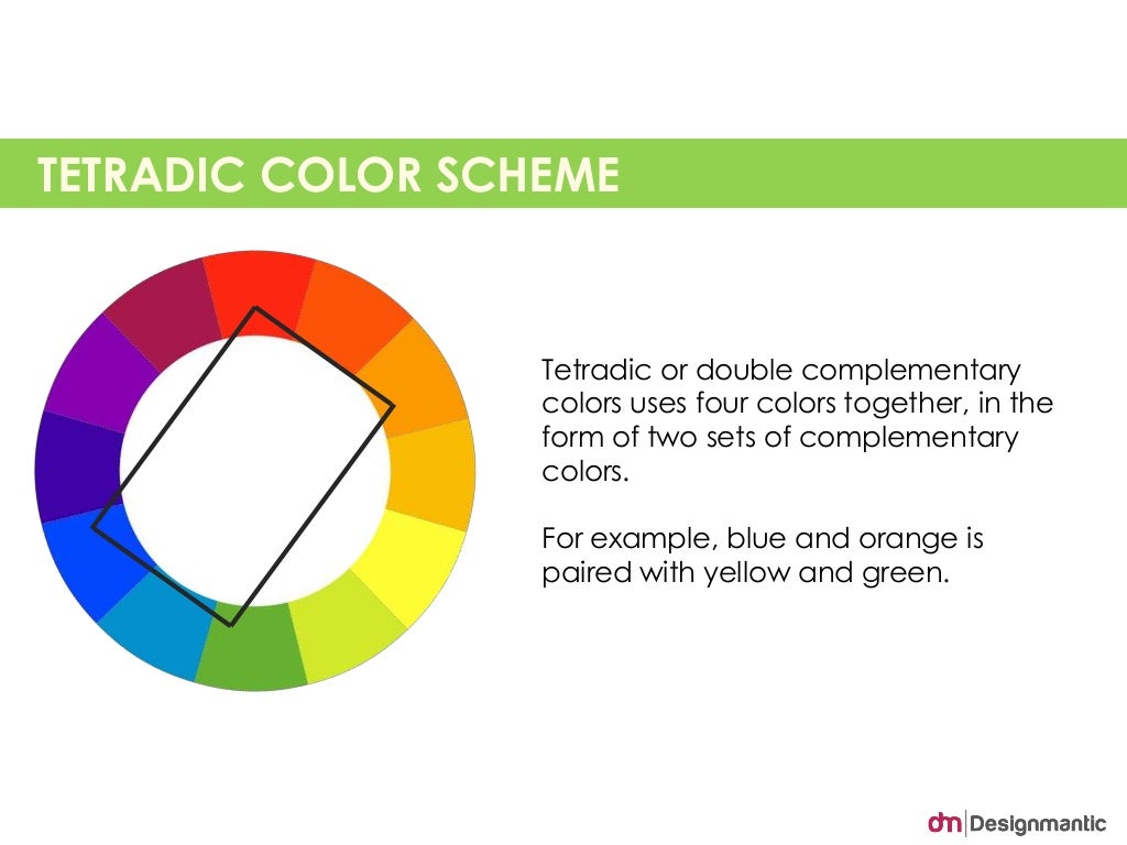
A tetradic color scheme is created by using four colors that are evenly spaced on the color wheel. This type of color scheme offers a lot of variety and can be quite exciting in a living room. You can choose to use warm colors, like red, orange, and yellow, or cool colors, like blue, green, and purple, or mix and match for a more eclectic look. Just make sure to balance the colors so that they don't compete with each other.Tetradic Color Scheme
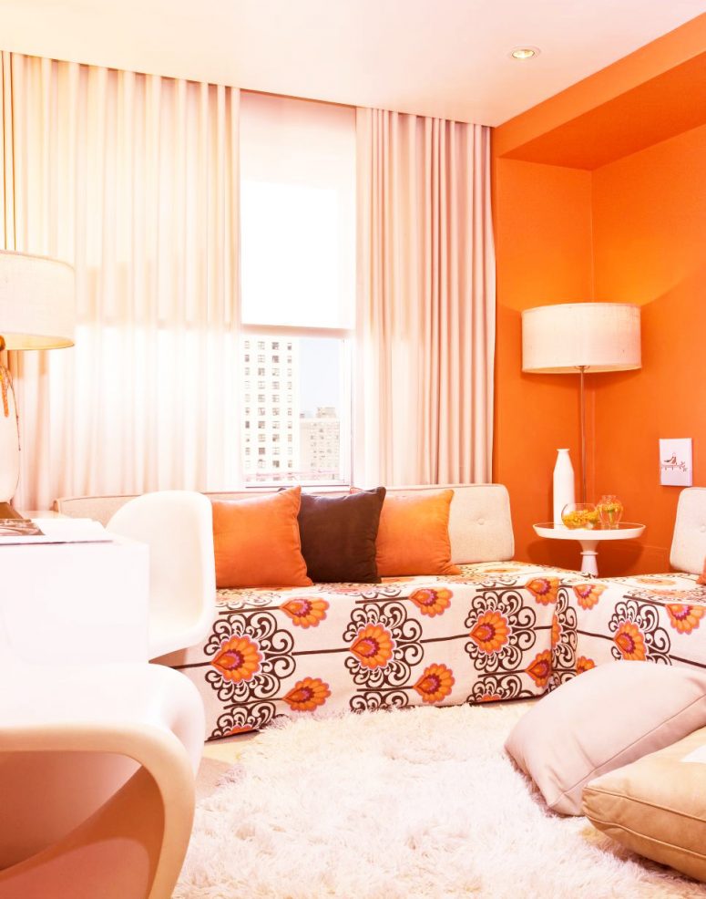
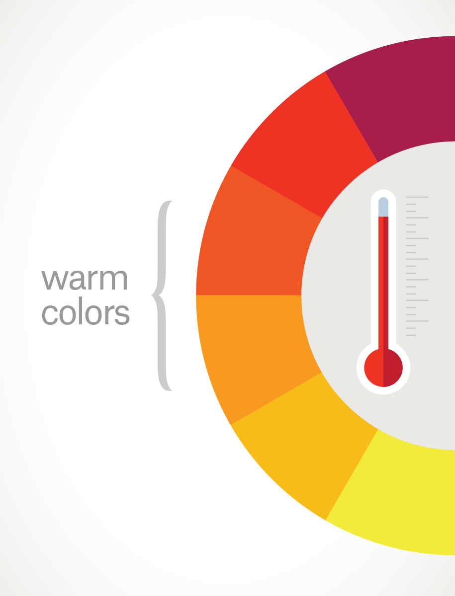
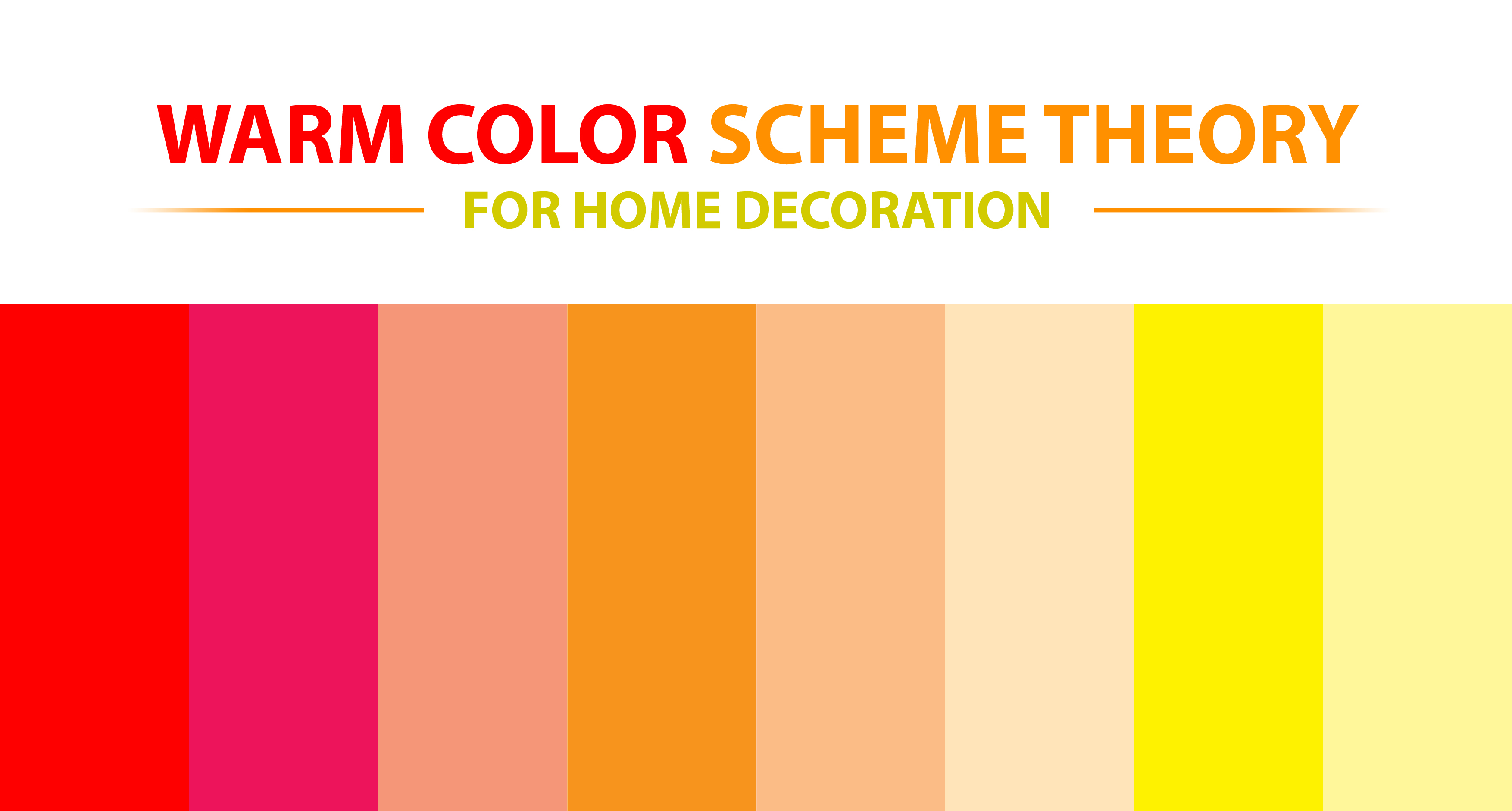
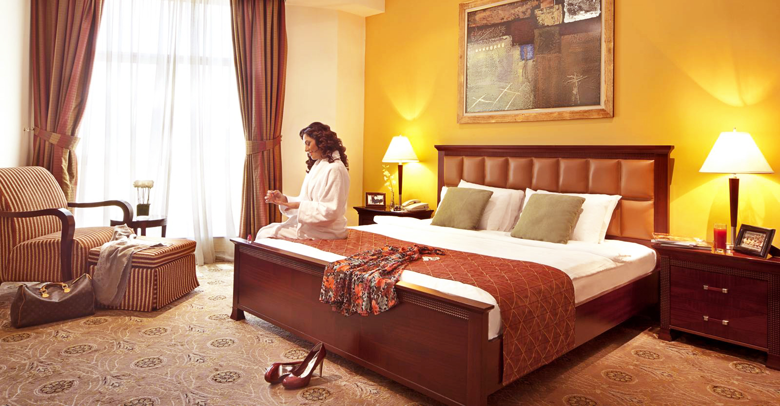
A warm color scheme uses colors that are associated with warmth, such as reds, oranges, and yellows. These colors are perfect for creating a cozy and inviting atmosphere in a living room. You could use a variety of warm shades, from pale peach to deep burgundy, to add warmth and personality to your space. Use cooler colors, like blue and green, as accents to balance out the warmth.Warm Color Scheme
A cool color scheme, on the other hand, uses colors that are associated with coolness, such as blues, greens, and purples. These colors can create a calming and serene atmosphere in a living room. You could opt for shades of light blue, seafoam green, and lavender for a tranquil and refreshing feel. Add touches of warm colors, like yellow or orange, for a pop of energy and contrast.Cool Color Scheme
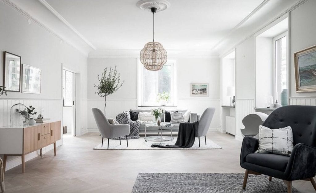
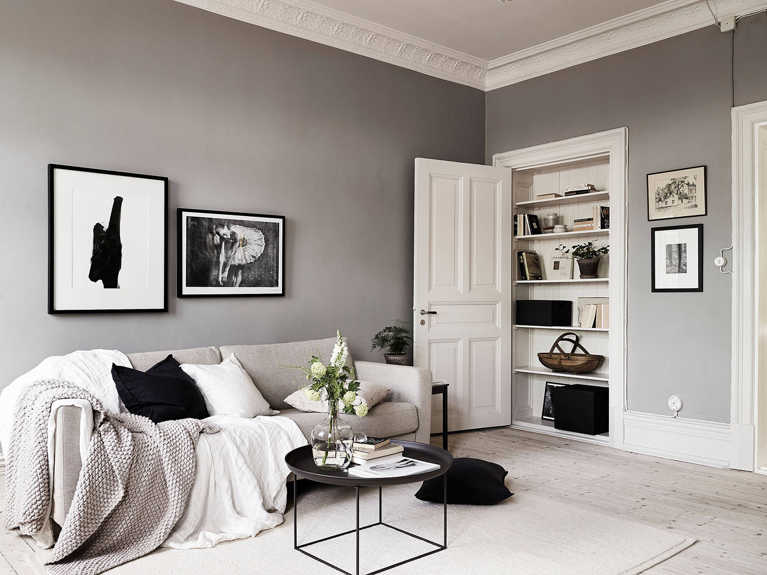
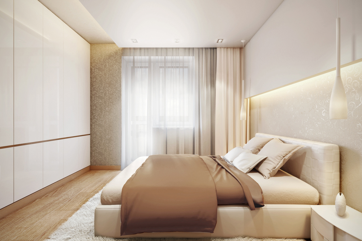
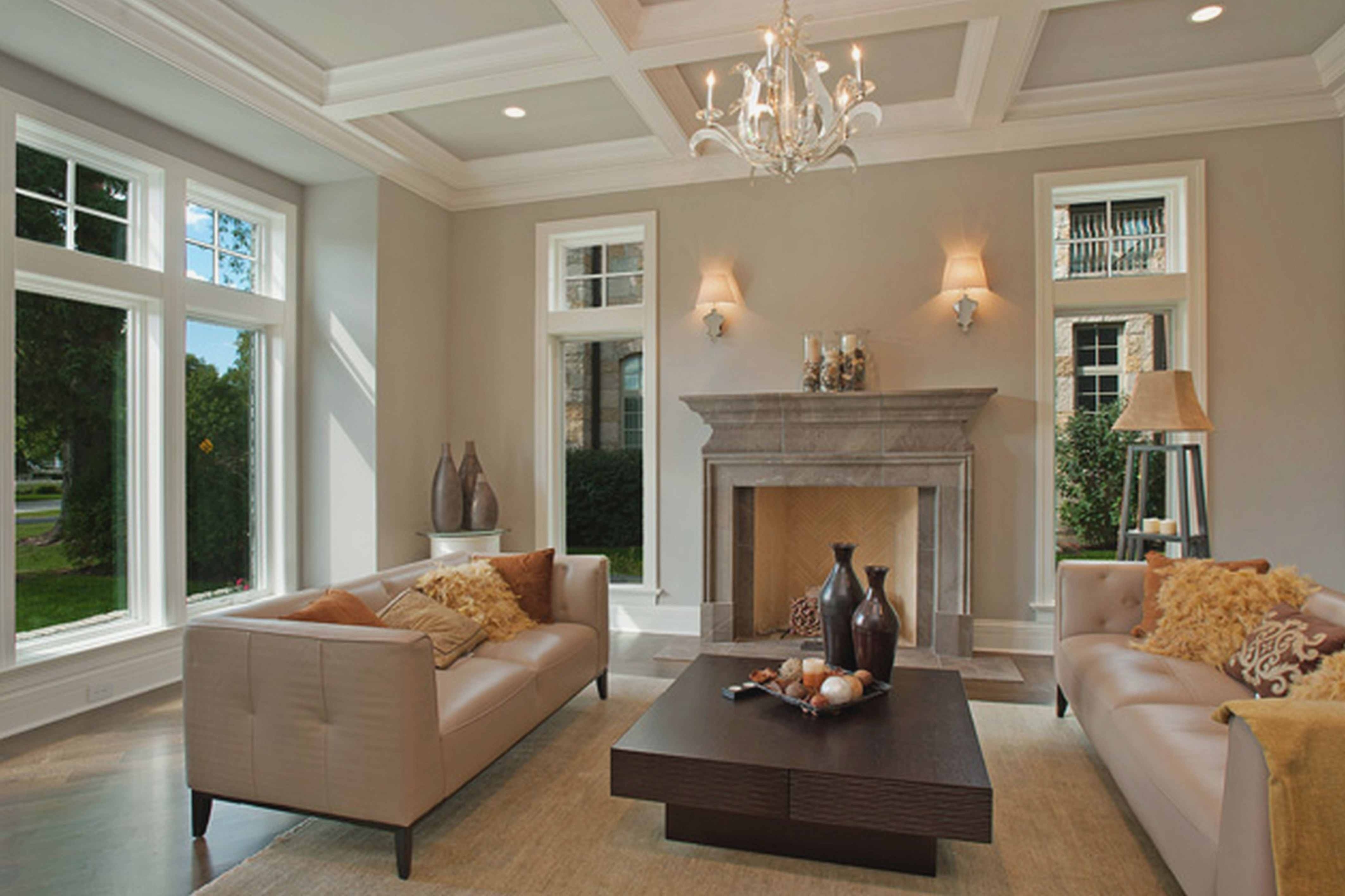
A neutral color scheme is a popular choice for living rooms as it creates a versatile and timeless look. This type of color scheme involves using shades of white, beige, gray, and brown. Neutral colors can help create a sense of balance and calm in a room, making them perfect for a living room. You can add pops of color, like jewel tones or pastels, to add interest and personality to a neutral color scheme.Neutral Color Scheme
A contrasting color scheme is created by pairing colors that are opposite on the color wheel. This creates a bold and dynamic look that can be quite striking in a living room. You could pair shades of red and green for a traditional Christmas-inspired look, or go for a more unexpected pairing, like pink and green, for a fun and playful vibe. Just make sure to balance the contrasting colors to avoid an overwhelming look.Contrasting Color Scheme
Types of Color Schemes for Living Room
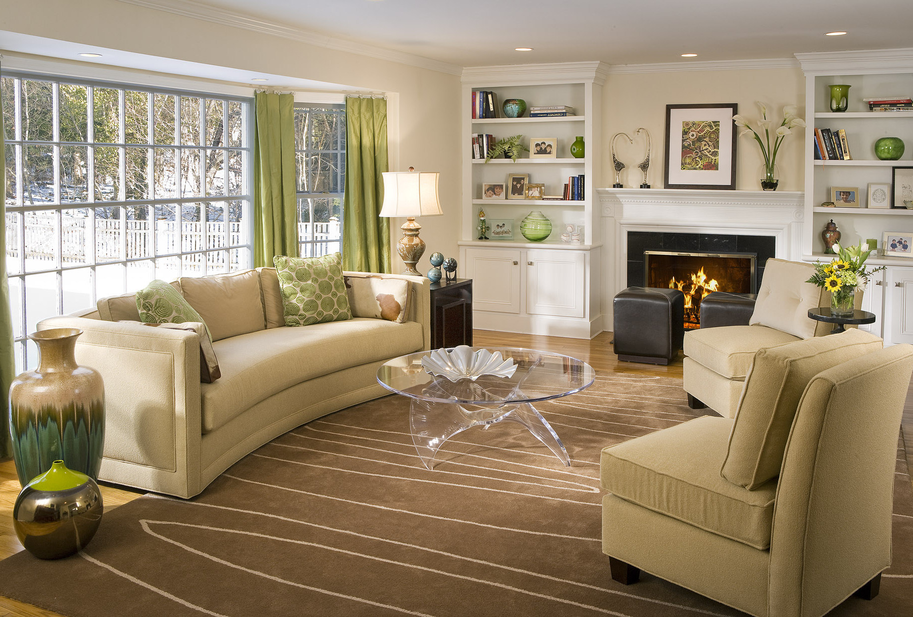
Neutral Color Scheme
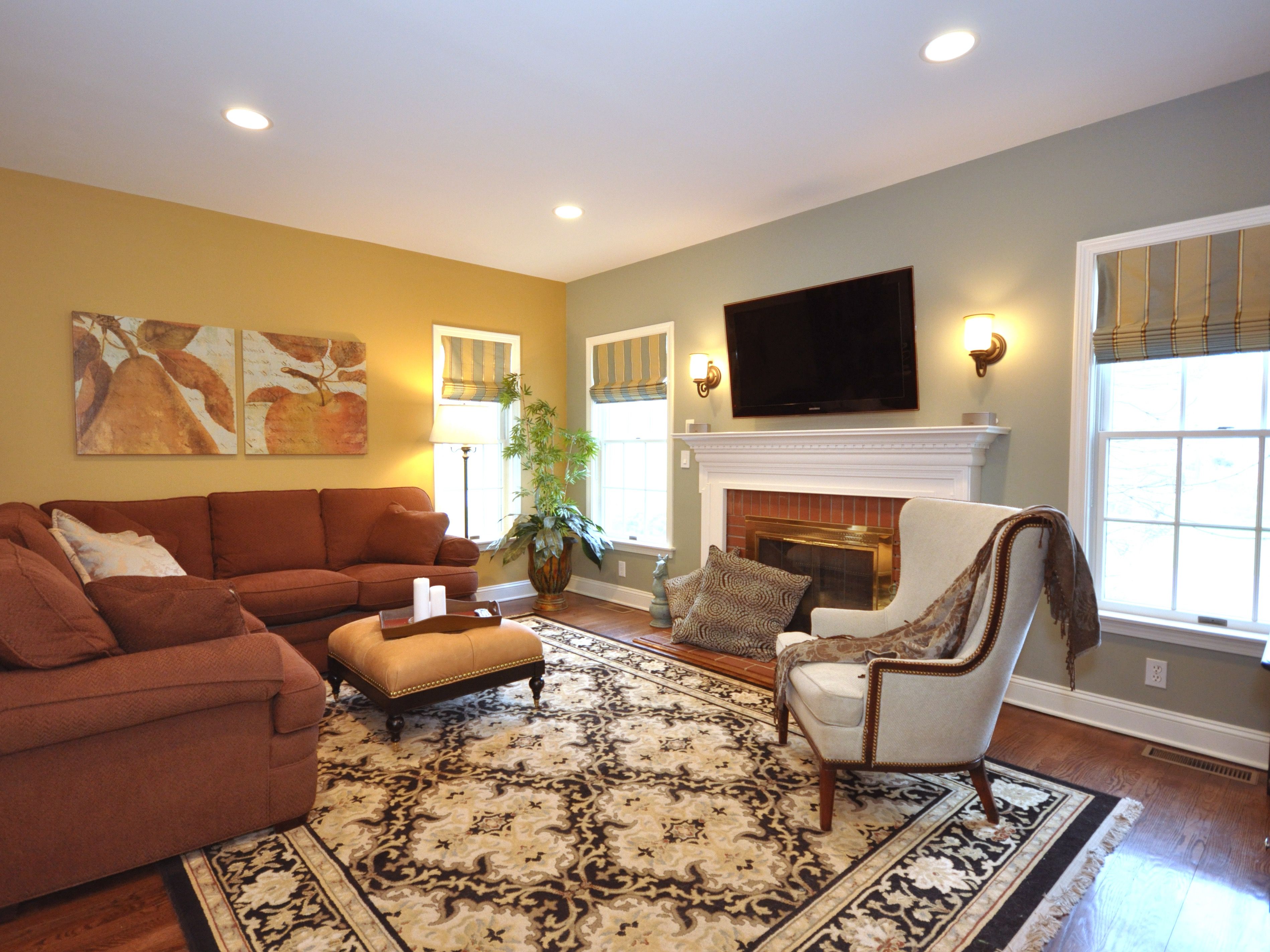 A neutral color scheme is a popular choice for living rooms as it creates a calm and inviting atmosphere. This color scheme is achieved by using shades of white, beige, and gray, and can be complemented with splashes of
bold colors
such as
navy blue, emerald green,
or
mustard yellow
. This type of color scheme allows for versatility in decor and can easily be changed or updated with
accent pieces
and
throw pillows
, making it a
timeless
and
budget-friendly
option for any living room.
Monochromatic Color Scheme
 For those who prefer a more
minimalistic
and
sophisticated
look, a monochromatic color scheme is the way to go. This color scheme involves using different shades of the same color throughout the living room. For example, a
light gray
wall can be paired with a
dark gray
sofa and
charcoal
throw pillows. This creates a
cohesive
and
harmonious
look, and can also make the living room appear
larger
and more
open
.
Analogous Color Scheme
 An analogous color scheme involves using colors that are next to each other on the
color wheel
. This creates a
harmonious
and
relaxing
atmosphere in the living room. For example,
shades of blue
such as
teal, sky blue,
and
navy
can be paired with
shades of green
such as
mint, olive,
or
emerald
. This type of color scheme is perfect for those who want to add a
pop of color
without it being too overwhelming.
Contrasting Color Scheme
 For those who want to make a
bold statement
with their living room, a contrasting color scheme is the way to go. This involves using
complementary colors
that are opposite each other on the
color wheel
. For example,
orange
and
blue
,
purple
and
yellow,
or
red
and
green
. This type of color scheme creates a
dramatic
and
energetic
atmosphere in the living room and is perfect for those who want to make a
bold statement
with their home decor.
In conclusion, choosing the right color scheme for your living room is essential in creating the
perfect
and
inviting
space for you and your family to relax and entertain. Whether you prefer a
neutral
and
versatile
look, a
minimalistic
and
sophisticated
vibe, a
harmonious
and
relaxing
atmosphere, or a
bold
and
energetic
statement, there is a color scheme out there that will suit your style and personality. So go ahead and
experiment
with different color combinations to find the perfect one for your living room.




























/Homedecorwarmcolors-GettyImages-640896866-596fcc88af5d3a00110c5931.jpg)








:max_bytes(150000):strip_icc()/what-is-a-neutral-color-1973822-03-3fab8b5a361d49638d3de1cbaf579a22.jpg)
/MyDomaine_ColorPalette-Neutral-2-3590678b1c9143e28dd6b536f0a1e008.jpg)

/neutral-color-scheme-CK-Garden-Stone-57e59bc15f9b586c35f4d16b.png)




/Small_Kitchen_Ideas_SmallSpace.about.com-56a887095f9b58b7d0f314bb.jpg)


