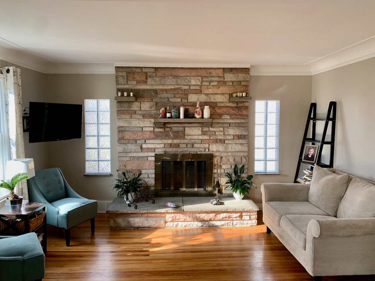
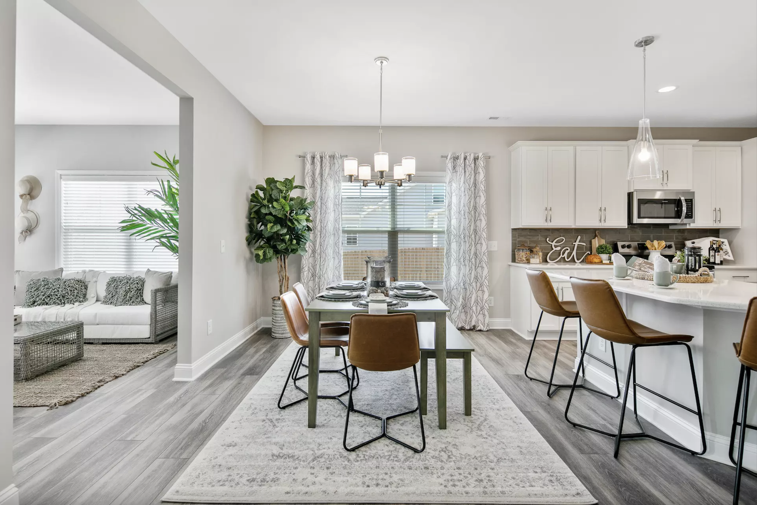
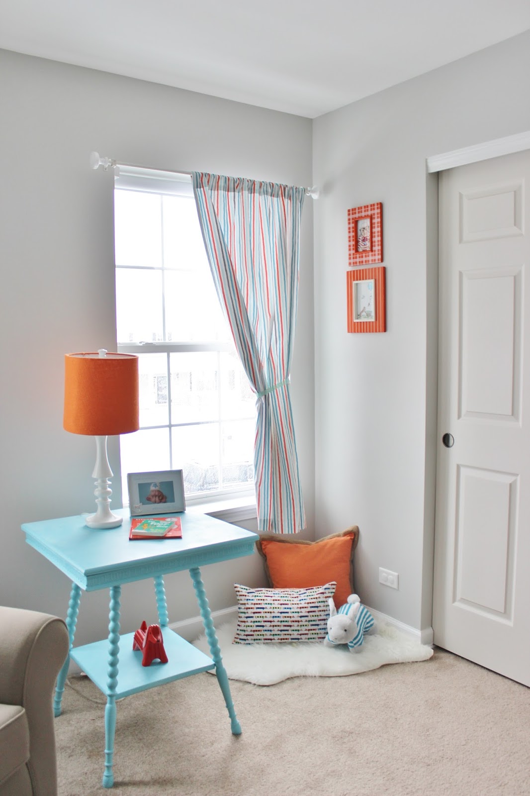
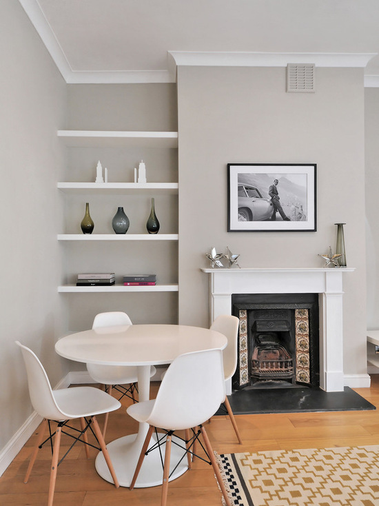
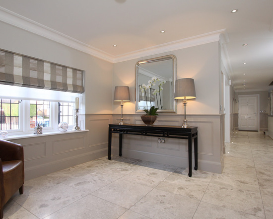
When it comes to creating the perfect dining room, choosing the right paint color is crucial. It sets the tone for the entire space and can make or break the overall design. One good paint color option for a dining room is Benjamin Moore's "Revere Pewter." This grayish beige hue is a timeless classic that adds warmth and sophistication to any dining room. It's a neutral shade that pairs well with a variety of accent colors such as navy blue, emerald green, or even a pop of bright yellow. Not only does "Revere Pewter" look great on the walls, but it also has a versatile quality that allows it to look different in various lighting conditions. It can appear lighter in a bright room or darker in a dimly lit space, making it a perfect choice for a dining room that may have different lighting needs throughout the day. Benjamin Moore's "Revere Pewter"

Benjamin Moore's "Revere Pewter"


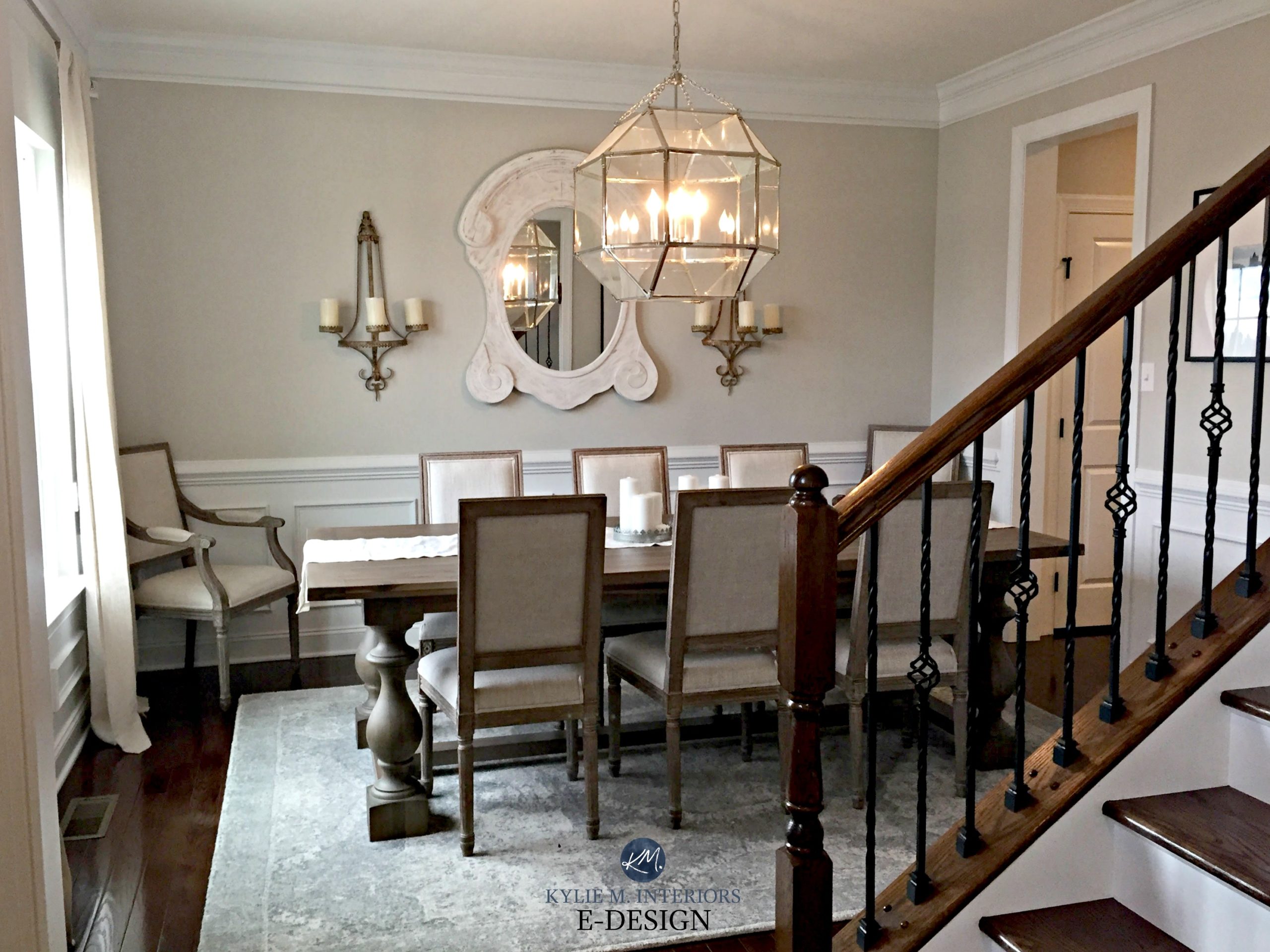
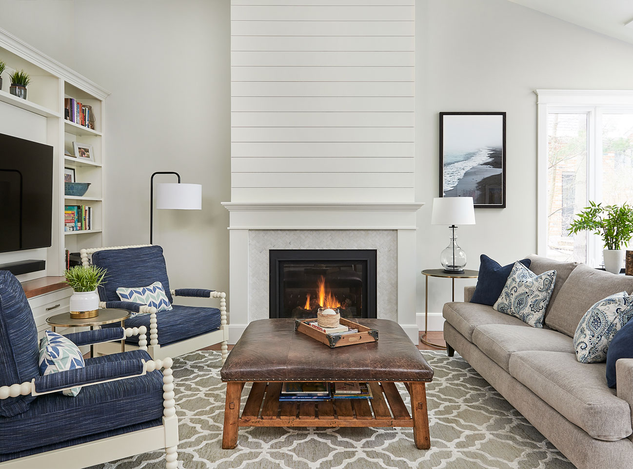
If you're looking for a warm and inviting paint color for your dining room, Sherwin Williams' "Agreeable Gray" is a top choice. This light greige shade has a soft and calming effect that instantly makes a room feel more welcoming. "Agreeable Gray" is also a versatile color that can work with a variety of decor styles. It pairs well with both modern and traditional elements, making it a great option for those who like to mix and match different design elements in their dining room. Additionally, this neutral shade has a subtle warmth to it that can help make a dining room feel more cozy and inviting. It's the perfect balance of cool and warm tones, making it a good paint color for any dining room. Sherwin Williams' "Agreeable Gray"


Sherwin Williams' "Agreeable Gray"


For those who prefer a light and airy dining room, Behr's "Swiss Coffee" is a great paint color to consider. This off-white shade has a clean and crisp look that instantly brightens up a space. "Swiss Coffee" is a versatile color that can work well in both formal and casual dining rooms. It pairs well with dark wood furniture and can also create a minimalist look when paired with lighter pieces. Additionally, this neutral shade has a calming effect that can make a dining room feel more relaxing and inviting. It's also a timeless color that won't go out of style, making it a safe and good paint color choice for any dining room. Behr's "Swiss Coffee"

Behr's "Swiss Coffee"


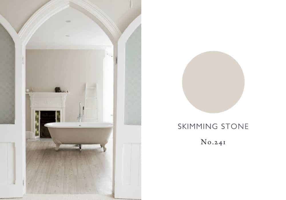
For those looking for a classic and elegant paint color for their dining room, Farrow & Ball's "Skimming Stone" is a top contender. This warm gray shade has a timeless appeal that adds a touch of sophistication to any space. "Skimming Stone" has a versatile quality that allows it to work well with a variety of decor styles. It pairs well with traditional furnishings and can also add a modern twist when paired with contemporary decor. What sets this good paint color apart is its subtle undertones. It has a hint of taupe that adds warmth and depth to a room, making it a great choice for a dining room that needs a touch of character. Farrow & Ball's "Skimming Stone"


Farrow & Ball's "Skimming Stone"


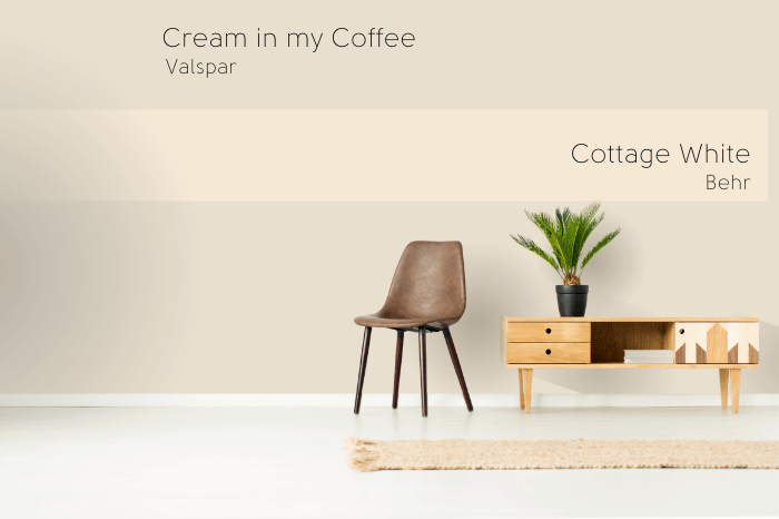
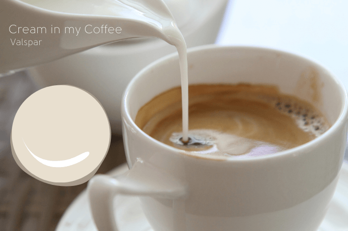
If you're looking for a soft and delicate paint color for your dining room, Valspar's "Cream in My Coffee" is a top contender. This warm beige shade has a subtle pink undertone that adds a touch of femininity to a space. "Cream in My Coffee" has a cozy and welcoming quality that can make a dining room feel more inviting and comfortable. It's a neutral shade that pairs well with both light and dark furnishings, making it a good paint color for any dining room. Additionally, this soft and delicate hue has a calming effect that can make a dining room feel more relaxing and peaceful. It's a timeless color that will never go out of style, making it a safe and good paint color choice for any dining room. Valspar's "Cream in My Coffee"


Valspar's "Cream in My Coffee"


For those who prefer a traditional and timeless look, Glidden's "Antique White" is a top choice for a dining room paint color. This off-white hue has a warm and welcoming quality that adds a touch of elegance to any space. "Antique White" is a versatile color that can work well with a variety of decor styles. It pairs well with traditional furnishings and can also add a rustic charm when paired with farmhouse elements. What sets this good paint color apart is its subtle beige undertone. It adds warmth and depth to a room, making it a great choice for a dining room that needs a touch of character. Glidden's "Antique White"
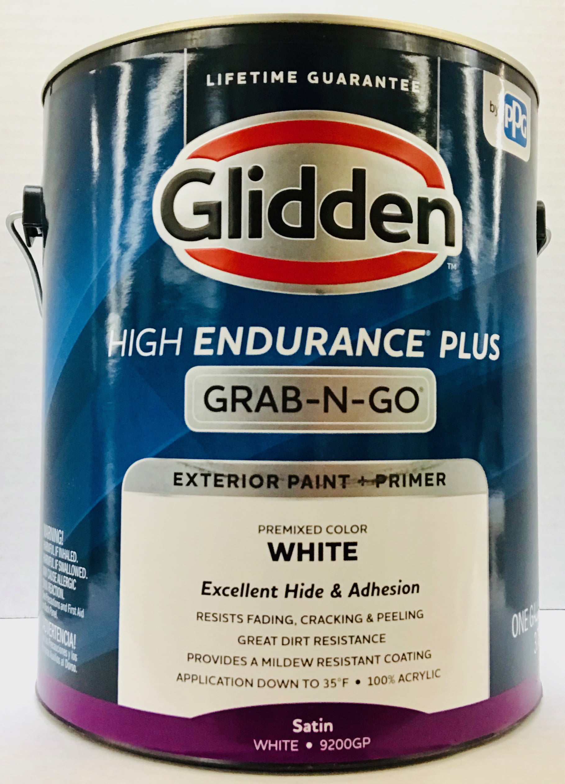

Glidden's "Antique White"


For those who prefer a cool and contemporary look, Benjamin Moore's "Gray Owl" is a top contender for a dining room paint color. This warm gray shade has a hint of blue that adds a modern edge to any space. "Gray Owl" has a versatile quality that allows it to work well with a variety of decor styles. It pairs well with modern furnishings and can also add a classic touch when paired with traditional elements. What sets this good paint color apart is its subtle undertones. It has a hint of coolness that adds a refreshing feel to a room, making it a great choice for a dining room that needs a touch of modernity. Benjamin Moore's "Gray Owl"


Benjamin Moore's "Gray Owl"


If you're looking for a soft and serene dining room, Sherwin Williams' "Sea Salt" is a top choice for a paint color. This light blue shade has a calming effect that can make a room feel more relaxing and peaceful. "Sea Salt" is a versatile color that can work well with a variety of decor styles. It pairs well with coastal and nautical elements, but can also add a tranquil feel when paired with minimalist decor. Additionally, this good paint color has a subtle gray undertone that adds depth and character to a space. It's a timeless color that will never go out of style, making it a safe and good paint color choice for any dining room. Sherwin Williams' "Sea Salt"

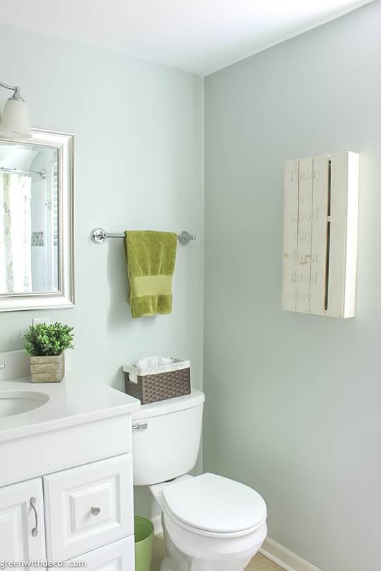

Sherwin Williams' "Sea Salt"


For those who prefer a rich and luxurious dining room, Behr's "Mushroom Bisque" is a top contender for a paint color. This warm taupe shade has a richness to it that adds a touch of sophistication to a space. "Mushroom Bisque" has a versatile quality that allows it to work well with a variety of decor styles. It pairs well with traditional furnishings and can also add a modern twist when paired with contemporary decor. What sets this good paint color apart is its warm undertones. It adds a cozy and inviting feel to a room, making it a great choice for a dining room that needs a touch of luxury. Behr's "Mushroom Bisque"


Behr's "Mushroom Bisque"


For those who want to add a dramatic touch to their dining room, Farrow & Ball's "Elephant's Breath" is a top choice for a paint color. This deep taupe shade has a boldness to it that can make a room feel more dramatic and moody. "Elephant's Breath" has a versatile quality that allows it to work well with a variety of decor styles. It pairs well with modern and eclectic elements, but can also add a classic touch when paired with traditional furnishings. What sets this good paint color apart is its deep undertones. It adds a richness and depth to a room, making it a bold and daring choice for a dining room. Farrow & Ball's "Elephant's Breath"


Farrow & Ball's "Elephant's Breath"


Why Choosing the Right Paint Color is Essential for a Dining Room

The Importance of a Dining Room in House Design
 When it comes to designing a house, the dining room often becomes an afterthought. However, a dining room is an essential space that brings family and friends together to share meals and create lasting memories. It is also a place where you can entertain guests and showcase your personal style. Therefore, it is crucial to give proper attention to the design and aesthetics of your dining room.
The Impact of Paint Color in a Dining Room
 The paint color of a room can significantly affect its overall look and feel. In the case of a dining room, the paint color chosen can set the tone for the entire space. A warm and inviting color can make the room feel cozy and intimate, while a cool and vibrant color can create a more lively and energetic atmosphere. It is essential to select a paint color that not only complements the rest of your home but also reflects the purpose of the dining room.
Good Paint Colors for a Dining Room
When it comes to choosing the perfect paint color for a dining room, there are several factors to consider. The first is the size of the room. For a small dining room, it is best to stick with lighter colors such as soft blues, greens, or neutrals. These shades can make the room appear more spacious and airy. In contrast, a larger dining room can handle bolder and darker colors such as deep reds, purples, or even black. These colors can create a more dramatic and sophisticated look.
Another factor to consider is the lighting in the room. Natural light can enhance the color of the paint, so it is crucial to test the color in both natural and artificial light. For a dining room with minimal natural light, it is best to choose warmer and brighter colors to avoid a dull and gloomy atmosphere.
Related Keywords: Dining Room Paint Colors, House Design, Aesthetics, Complement, Lighting
The paint color of a room can significantly affect its overall look and feel. In the case of a dining room, the paint color chosen can set the tone for the entire space. A warm and inviting color can make the room feel cozy and intimate, while a cool and vibrant color can create a more lively and energetic atmosphere. It is essential to select a paint color that not only complements the rest of your home but also reflects the purpose of the dining room.
Good Paint Colors for a Dining Room
When it comes to choosing the perfect paint color for a dining room, there are several factors to consider. The first is the size of the room. For a small dining room, it is best to stick with lighter colors such as soft blues, greens, or neutrals. These shades can make the room appear more spacious and airy. In contrast, a larger dining room can handle bolder and darker colors such as deep reds, purples, or even black. These colors can create a more dramatic and sophisticated look.
Another factor to consider is the lighting in the room. Natural light can enhance the color of the paint, so it is crucial to test the color in both natural and artificial light. For a dining room with minimal natural light, it is best to choose warmer and brighter colors to avoid a dull and gloomy atmosphere.
Related Keywords: Dining Room Paint Colors, House Design, Aesthetics, Complement, Lighting
Conclusion
 In conclusion, choosing the right paint color for a dining room is essential in creating a space that is not only visually appealing but also functional. It is a chance to showcase your personal style and set the tone for the room's purpose. By considering factors such as room size, lighting, and desired atmosphere, you can find the perfect paint color that will make your dining room a welcoming and enjoyable space for all.