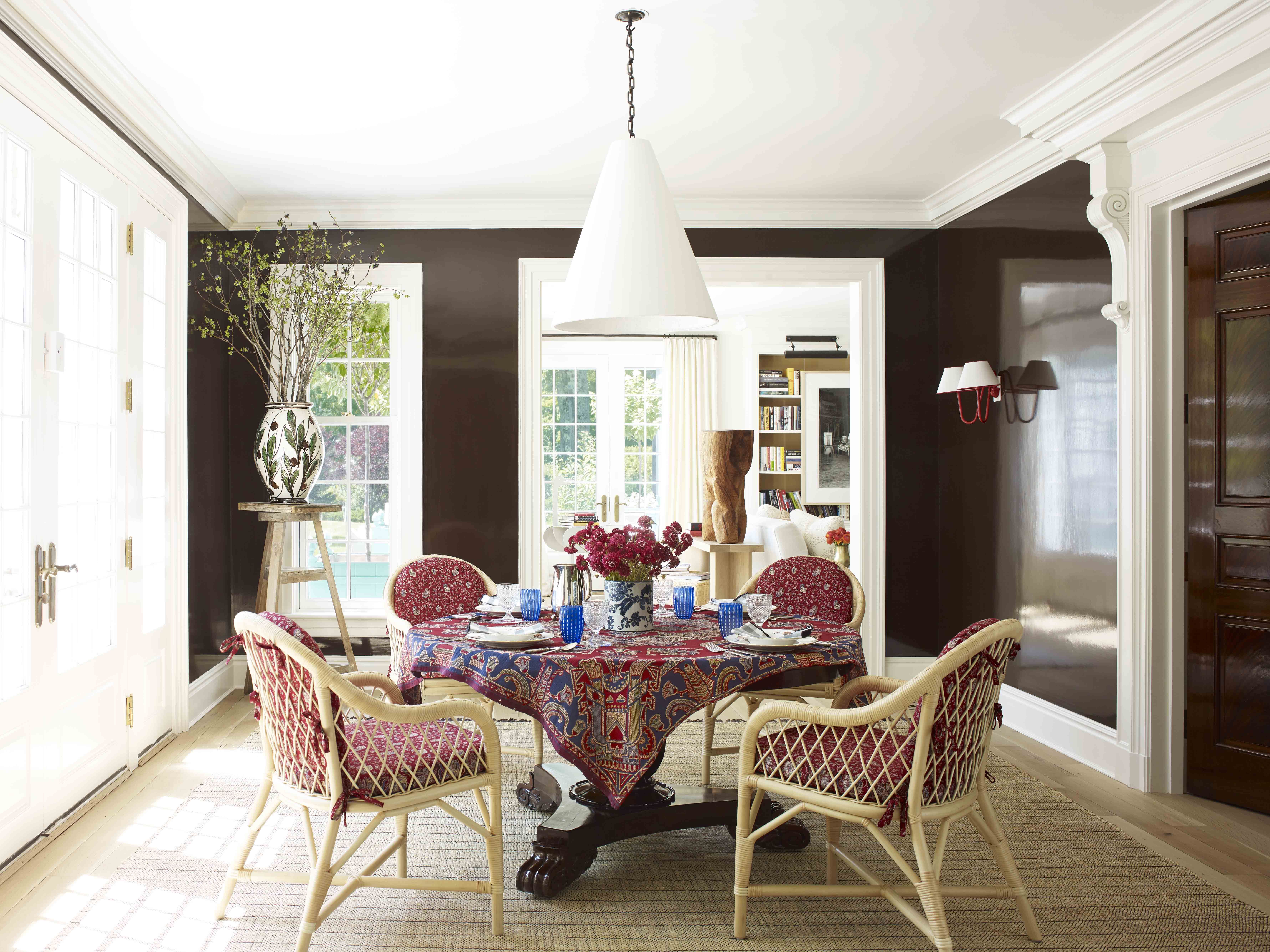
The first color to avoid in your dining room is dark colors such as black, brown, dark green, and dark blue. While these colors may seem elegant and sophisticated, they can make your dining room feel small and cramped. Dark colors also tend to absorb light, making the room feel dim and gloomy. Instead, opt for lighter shades like pastels or neutrals to make your dining room feel more spacious and inviting.Dark Colors


Dark Colors


While red is often associated with passion and energy, it's not the best choice for a dining room. This bold and intense color can be overwhelming and may even affect your appetite. Additionally, red can be difficult to match with other colors and furniture, making it a challenging color to work with in your dining room. Instead, try incorporating red accents through smaller elements like throw pillows or wall art.Red


Red


Black is a classic color that can add a touch of sophistication to any room. However, when it comes to your dining room, it's best to avoid using too much black. Similar to dark colors, black can make the room feel smaller and dimmer. It can also be a difficult color to maintain, as it shows dust and fingerprints easily. If you still want to incorporate black into your dining room, consider using it as an accent color or in smaller doses.Black


Black


Brown is a warm and cozy color, but it's not the best choice for a dining room. This color can make the room feel heavy and dark, especially when paired with dark wood furniture. It can also be challenging to find the right shade of brown that complements your dining room decor. Instead, consider using lighter shades of brown or incorporating it through natural wood accents.Brown


Brown


Gray has been a popular color in home decor in recent years, but it's not the most suitable choice for a dining room. Similar to black and brown, gray can make the room feel dull and lifeless, especially if it's a dark shade. Additionally, gray can be challenging to match with other colors, making it a tricky color to work with. If you still want to incorporate gray into your dining room, opt for lighter shades or use it as an accent color.Gray


Gray


While green is often associated with nature and freshness, dark green can have the opposite effect in your dining room. Dark green can make the room feel heavy and dull, especially if there isn't enough natural light. It can also be challenging to match with other colors and furniture. If you love the color green, consider using lighter shades or incorporating it through plants and other natural elements.Dark Green


Dark Green


Similar to dark green, dark blue can also make your dining room feel heavy and gloomy. It can also be an overpowering color, making it difficult to pair with other colors and furniture. If you want to incorporate blue into your dining room, opt for lighter shades or use it as an accent color through smaller elements like curtains or table linens.Dark Blue


Dark Blue


Purple is a bold and vibrant color, but it's not the best choice for a dining room. This color can be overwhelming and may even affect your appetite. It can also be challenging to match with other colors and furniture. If you still want to use purple in your dining room, opt for lighter shades like lavender or use it as an accent color through smaller elements like artwork or vases.Purple


Purple


While orange is a fun and energetic color, it's not suitable for a dining room. This bright and bold color can be overwhelming and may even affect your mood. It can also be challenging to match with other colors and furniture. If you still want to incorporate orange into your dining room, consider using it as an accent color or in smaller doses.Orange


Orange


Yellow is often associated with happiness and positivity, but it's not the best choice for a dining room. This bright and vibrant color can be overwhelming and may even affect your appetite. It can also be challenging to match with other colors and furniture. If you still want to use yellow in your dining room, opt for softer shades like pastel yellow or use it as an accent color through smaller elements like throw pillows or wall art.Yellow


Yellow


Why Avoid Certain Colors in the Dining Room?

The Impact of Colors on Dining Experience
 When designing your dining room, choosing the right colors is crucial. Not only do they set the tone and mood of the space, but they also have a significant impact on your dining experience. The right colors can stimulate appetite, promote social interactions, and create a welcoming atmosphere. However, there are certain colors that should be avoided in the dining room, as they can have a negative effect on your dining experience.
Colors to Avoid in the Dining Room
 Red
is a bold and energetic color that can stimulate appetite and conversation. However, it is also known to increase blood pressure and heart rate, which can be overwhelming in a dining room setting. Additionally, too much red can create a sense of urgency and make diners feel rushed, leading to a less enjoyable dining experience.
Black
is a sleek and sophisticated color, but it can also create a sense of heaviness and sadness when used in excess. In a dining room, black can make the space feel cramped and uninviting, and it can also absorb light, making the room appear darker and less welcoming.
Yellow
is a cheerful and bright color, but it can also be overwhelming in large doses. Too much yellow in the dining room can cause eye strain and headaches, making it difficult for diners to relax and enjoy their meals. Additionally, yellow can stimulate hunger, but it can also suppress appetite in some people, leading to an unbalanced dining experience.
Red
is a bold and energetic color that can stimulate appetite and conversation. However, it is also known to increase blood pressure and heart rate, which can be overwhelming in a dining room setting. Additionally, too much red can create a sense of urgency and make diners feel rushed, leading to a less enjoyable dining experience.
Black
is a sleek and sophisticated color, but it can also create a sense of heaviness and sadness when used in excess. In a dining room, black can make the space feel cramped and uninviting, and it can also absorb light, making the room appear darker and less welcoming.
Yellow
is a cheerful and bright color, but it can also be overwhelming in large doses. Too much yellow in the dining room can cause eye strain and headaches, making it difficult for diners to relax and enjoy their meals. Additionally, yellow can stimulate hunger, but it can also suppress appetite in some people, leading to an unbalanced dining experience.
Alternative Color Options
 If you want to create a warm and inviting dining room without the negative effects of these colors, consider using
earth tones
such as beige, taupe, and olive green. These colors evoke a sense of nature and can create a cozy and relaxed atmosphere in the dining room.
Blue
is also a great option, as it has a calming effect and can promote conversation and relaxation during meals.
If you want to create a warm and inviting dining room without the negative effects of these colors, consider using
earth tones
such as beige, taupe, and olive green. These colors evoke a sense of nature and can create a cozy and relaxed atmosphere in the dining room.
Blue
is also a great option, as it has a calming effect and can promote conversation and relaxation during meals.
Conclusion
 In conclusion, when designing your dining room, it is important to choose colors that will enhance your dining experience and create a welcoming atmosphere. Avoiding certain colors such as red, black, and yellow can prevent negative effects on mood and appetite, and opting for alternative colors can create a more balanced and enjoyable dining experience. Keep these tips in mind when designing your dining room to create a space that is both beautiful and functional.


